Nate Silver decided to launch fivethirtyeight.com on Monday as opposed to last week so he could launch the site with his own NCAA Tournament predictions and a little strategy about how to fill out your bracket. Even though college basketball’s single elimination format makes outcomes less predictable, lots of people are looking for any edge they can get in their March Madness pools. Silver’s timing makes sense. Outside of elections, the NCAA Tournament may have the highest demand for quantitative predictions of outcomes here in the United States.
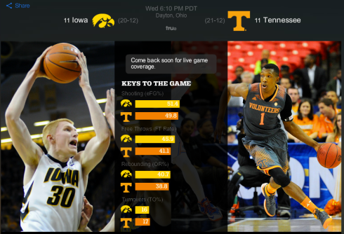
While Silver defines his political coverage as a kind of corrective to the predictions of traditional pundits, college basketball is not an area that appears to need this corrective. If you happen to sneak away from work tomorrow to watch opening round games of the NCAA Basketball Tournament, you will probably see a preview screen that looks like this while waiting for a game to start:
The graphics for “keys to the game” are difficult to read in this screenshot, but I’m not here to troll the lack of contrast. Instead, I want to point out how CBS’ online preview screen is embracing advanced statistics. If you could read the screen, you would see the “keys to the game” are eFG%, FT Rate, OR% and TO%. CBS is telling us each team’s record, but they aren’t telling us traditional things in a preview like Iowa scores 82 points per game and Tennessee scores 71.3 points per game. CBS isn’t telling us a count of which team gets more rebounds or which team commits more turnovers.
In college basketball, it is critical to look at statistics as rates instead of counts when predicting a winner, because some teams play much faster or slower than others. (I’m sure friends who are rooting for Wisconsin or Virginia can sympathize.) According to Dean Oliver, the four rates CBS put on its preview screen are the best way to predict basketball success. Quantitative analysts debate Oliver’s weighting (he has shooting at 40%, turnovers 25%, rebounding 20%, free throws 15%), but Oliver’s “four factors” is a common starting point for analysis.
In many ways, it makes sense that college basketball would be the sport where mainstream national columnists and broadcasters adopted “advanced statistics” with relatively little resistance. Anyone who spends tomorrow watching the NCAA Tournament will realize that a 10 point Wisconsin lead feels very different than a 10 point Oregon or BYU lead. It’s easy to convince columnists that rates are more informative than counts. It’s also easy for journalists and broadcasters to find an analyst who will take all the different rates and a few other key variables, combining them in to one number for offensive and defensive “efficiency” (I subscribe to Ken Pomeroy’s stats – it’s only $20 and a great investment for a college hoops fan.)
On the other hand, CBS’ preview graphic leaves a lot to be desired as a way to introduce casual viewers to these ideas. For starters, they only present offensive statistics, ignoring defense. Viewers do not get to see Tennessee’s defensive prowess throughout the year. Second, the acronyms on the screen won’t make sense to someone who doesn’t already know them. Live announcers assume viewers don’t know the acronyms and will explain the concepts on-air. Third, the photos do not feature either of Tennessee’s star players, which seems like a particularly glaring mistake for an upcoming TV broadcast! That being said, it’s an encouraging sign that CBS does not fear putting more sophisticated statistics on screen for the entire audience.
